

Role
UI Designer
Tools
Figma – For Prototype
Angle – For Mockups
Duration
1 Month
Introduction
Perfect Properties is the project that I made for my UI Specialization course. It is a responsive web app designed for users looking to find real estate to invest in. I chose this project for several reasons. Firstly, I have a great deal of experience in real estate from before through flipping a house. I was very much involved with the process of listing a property and putting it together so it appeals to people looking to buy. Secondly, I am looking to become a homeowner in the future myself, so I am very interested in real estate and the process of searching for the ideal property.
The guidelines for this project were to create a user-friendly design that allows users to search for properties, input criteria relevant to what they are looking for, easily view and return to listings users are interested in, and receive relevant and comprehensive information about properties.
Goals and Process
- My initial objective: I want to ensure that this responsive web app is as personalized as possible and can cater to what the user is interested in. For example, when I’m prospecting for properties, I have a lot of factors I consider that I notice aren’t always available on other property searching platforms. I think it’s important to factor in aspects of safety, quality of schools, and proximity to important things. I could keep listing the qualities to look for when finding a property, but I will add all of this to the app when I’m making it.
- Who I’m designing for: This web app is made primarily for new, small-scale property buyers who are looking to invest for additional income or financial security.
- Design Goals / User Stories:
- As a user, I want to create a profile containing all my property criteria, so that I am recommended results most relevant to me.
- As a user, I want access to as much written and visual information as possible about properties I’m interested in so that I can make an informed decision.
- As a user, I want to be able to search and filter properties, so that I can find good matches based on my needs.
Initial User Flow

Interaction
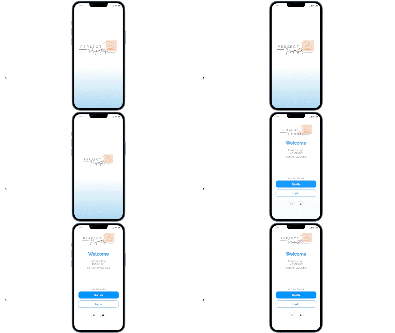
This is the loading screen animation transitioning from the Splash Screen into the login and sign-up page.
Wireframes and Mockups
My design was formatted with the logging in and signing up process being standard and understandable for users. When users are signing up for the first time and still setting up their accounts, there is an onboarding process that allows users to customize what they are looking for in a property. This can also be adjusted at any time in the Preferences section.
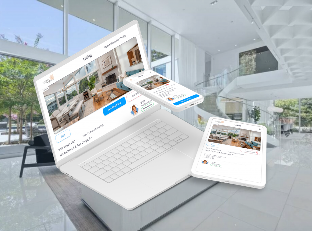
There is the main home page where users can scroll through relevant property listings based on their criteria. There is also a way to add properties to favorites by tapping the favorite button. When users tap on a listing it will open up a page that provides users with listing details and the ability to get in contact with the real estate agent. Finally, there is a map search feature to look for properties based on an exact location. The map and home pages are combined on the tablet and desktop versions of the app.


Style Guide
For the overall style of Perfect Properties, I wanted to create something that looked visually appealing and welcoming for users while also maintaining a level of minimalism and sophistication.


Mood Board

My Learnings
Throughout this project, I’ve gained a tremendous amount of new skills that will help me going forward in my future designs. Firstly, I learned how to design with transitions and animations in mind, making elements blend and feel seamless. I struggled a lot with figuring out the spacing and placement of elements. It took me some time to figure out the best possible layout and measurements. Lastly, I’ve gained some newfound skills in breakpoints and scaling up a design to different devices. A noteworthy takeaway from my experience of designing for different breakpoints was learning about the importance of using scalable vectors to maintain image quality.
One of the biggest challenges that I faced was the challenge of designing for accessibility. My initial vision for my mood board included some lighter pastel-style colors. There were a few problems with implementing those colors. First of all, it didn’t look as good as I wanted it to and none of the elements stood out due to the softer colors. But secondly and more importantly, the colors didn’t meet accessibility standards. To solve this problem I started getting familiar with the contrast checker to make sure that the colors were dark enough so that users with visual impairments would be able to understand what is being written.