
By Alex Mays
Problem Statement
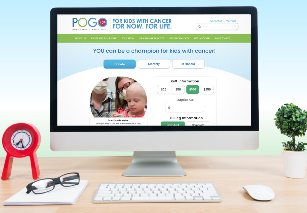
POGO wants to help improve and simplify their donation process to increase the number of donations and improve user satisfaction.
About POGO
I was tasked with improving the user experience of an existing website for a client named Pediatric Oncology Group of Ontario (POGO). POGO is a non-profit organization with charitable status dedicated to ensuring everyone affected by childhood cancer has access to the best care and support.
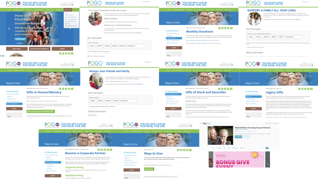
The existing website
Sitemap
Here is the full sitemap of the POGO website along with the redesigned and simplified sitemap for the Ways to Give Section.

User Persona
User Persona
I created a user persona as an example of somebody looking to donate to the Pediatric Oncology Group of Ontario. Maya has strong motivations to make a donation and could be convinced to make multiple recurring donations if she has a positive experience.

Research
Key Takeaways
Research
Key Takeaways
During my research, I started exploring the existing POGO website and navigated my way through each and every page. This helped me to get a better personal understanding of the usability, experience, and helped me empathize with users in preparation for my usability testing.
Next, I looked at some similar companies such as the Canadian Cancer Society, MS Canada, and Breast Cancer Canada websites to see how their donation processes worked in order to compare and contrast with my experience using POGO. I took note of any similarities I found amongst the other websites and which aspects of their experiences I thought worked better than the current POGO donation experience.
I then began brainstorming potential problems and potential solutions that I could put to the test by taking real people through usability testing of the website.
SWOT Analysis
I began brainstorming the layout and functionality of the improved website, and before I finalized the design, I created a SWOT analysis based on similar companies with donation features including Canadian Cancer Society, MS Canada, and Breast Cancer Canada . The purpose of this was to zoom out on our project and see anything that we could add or improve upon before going through creating the design.
Usability Testing Results
I conducted moderated, in-person usability tests and interviews with six different people. The goal of the usability testing was to figure out which elements could be improved throughout the entire ways to give section. I first asked each participant to go through each kind of donation as if they were making a donation themselves. Next, I asked each participant to explore the rest of the Ways to Give section as if they were looking for information on the different ways to give. Finally, I asked them to tell me any thoughts or opinions they had on their experience including any problems they ran into along the way and what they think could help improve their experience.

Solutions
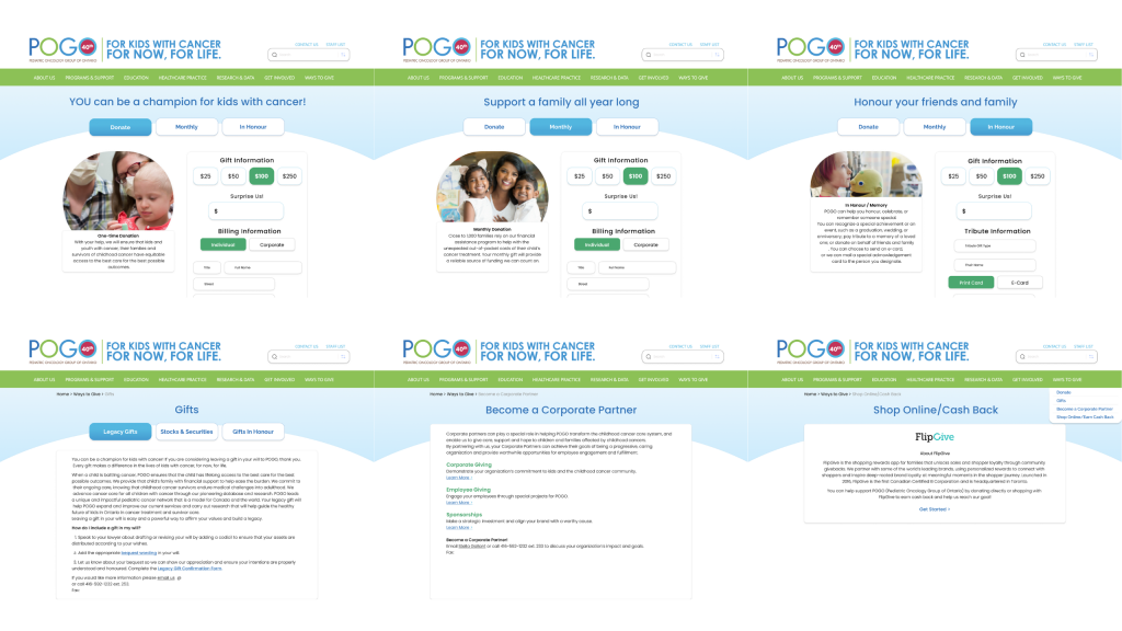
I redesigned the Pediatric Oncology Group of Ontario website after brainstorming, and organizing all of my research findings. I came up with a simplified layout of the Ways to Give section with 4 pages rather than the previous 7-8. This redesign is primarily focused on the usability of the website and the information and the imagery are almost entirely the same as before.
The updated Donation page has three buttons at the top where users can easily switch between donation types without being redirected to new pages with different layouts.
The updated Gifts page has a similar and familiar format with three buttons at the top where users can easily switch between legacy gifts, stocks and securities gifts, and gifts in honour.
The Become a Corporate Partner section is now condensed into one single page, with expandable ‘Learn More’ buttons available instead of being redirected to different pages. There is also the proper contact information available on the page as well.
Finally, the Shop Online/Cash Back section now features an explanation of FlipGive and a ‘Get Started’ button as a transition before being redirected to the different fundraising website so users understand what is happening and have the right information.


User Flow
I created this simplified user flow for the Ways to Give section based on my usability testing and interviews. This new format is set up with four main sections and has much simpler and more seamless transitions between the different kinds of donations and a more understandable delivery of information.

The redesign
Future Ideas
Going forward, I would love to continue to research and test with people and develop the design of the Ways to Give section even more. I think that this updated design for the Ways to Give section is a strong start and I think it would be incredibly beneficial to work on designs for the other sections of the POGO website for helping to create better usability and improve user satisfaction.